


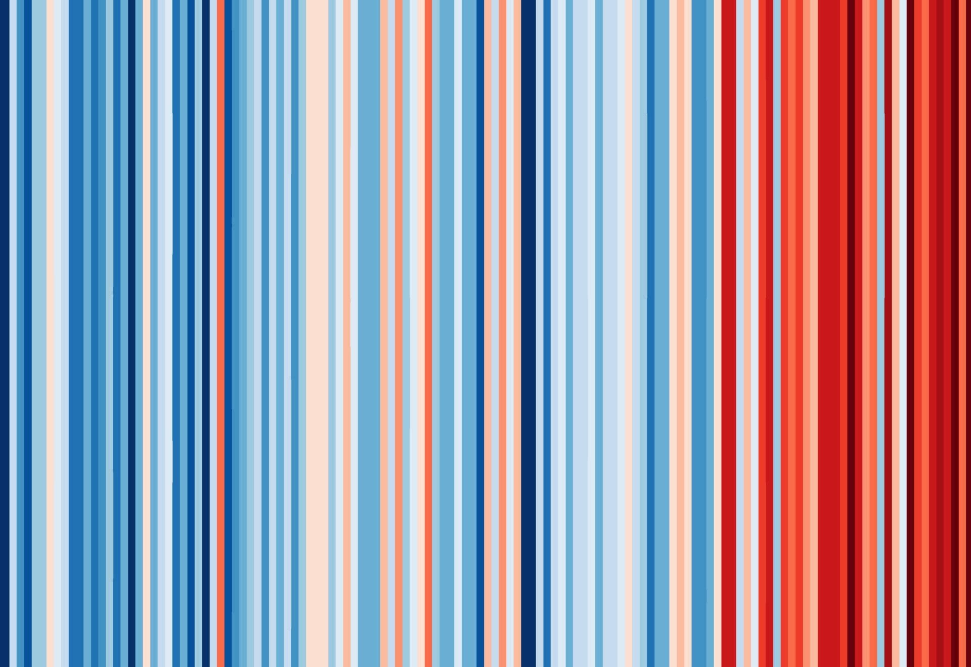
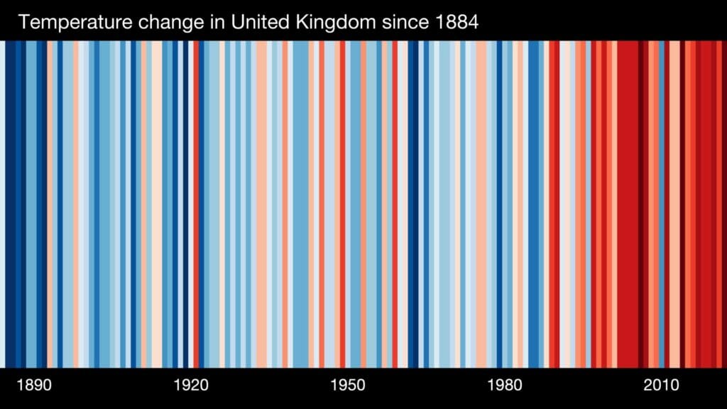
RISING temperatures in the UK’s major cities have been visualised in striking new graphics.
The latest versions of the University of Reading’s climate stripes were released on Friday, April 2, presenting temperatures in 13 cities, all of which recorded their warmest year on record in 2022.
The stripes visualise the change in temperature in the UK from the past 100+ years and had previously only been available for the UK’s four nations, Berkshire, Durham, Oxford and Jersey.
Now, graphics for Birmingham, Bristol, Cardiff, Coventry, Edinburgh, Glasgow, Hull, Leeds, Leicester, Liverpool, London, Manchester and Sheffield, and have been released.
Stripes creator Prof Ed Hawkins, climate scientist at the University of Reading and National Centre for Atmospheric Science, said: “We wanted to create these very localised stripes to give people an indication of how things are changing right where they live.
“We know that different parts of the UK have different landscapes, different key industries, and different population sizes – and all of this can have an impact both on emissions, and average temperatures.
“Our key observation is that regardless of all these factors, the trend remains the same – most of the more recent years have been a lot warmer than most of the years a century ago.
“After the dangerous heatwaves we experienced last summer, I hope this new city data will serve as a reminder of the very-real impact rising temperatures are having on our lives and inspire people up and down the country to play their part in helping our communities avoid the worst possible impacts of climate change.”
New graphics for every country around the world have also been unveiled and now include data from before 1900 via the Berkeley Earth project.
Stripes are available to view and download for cities, countries, continents and the globe via the Show Your Stripes website.
Using data from the Met Office, the University of Reading has also partnered with UK charity Carbon Copy to produce stripes for individual UK counties, which can be downloaded from the Carbon Copy website.
Detailed information about emissions and local climate action plans is also available.
Ric Casale, Carbon Copy co-founder, said: “We know that the effects of climate change, bigger storms, longer summer droughts, and more flooding – are happening right now, right here.
“Climate change is no longer an abstract issue for someone else to deal with, it’s something that people in the UK can see and feel locally, where they live.”
Last week, the University of Derby launched its #BiodiversityStripes, a similar representation which shows the global change in biodiversity from 1970-2019.
The highest level of biodiversity is coloured bright green. Lower levels move from yellow to grey, depending on the level of decline. Darker greys appear with greater declines.
The global data, which includes more than 5,000 species, shows the population of mammals, birds, fish, amphibians and reptiles has seen an average drop of 69% globally since 1970.
Prof Miles Richardson, professor of human factors and nature connectedness at the University of Derby, said: “Only by addressing both the warming climate and loss of wildlife do we stand a chance of passing on a stable planet for future generations, yet biodiversity loss has had far less coverage.
“The ‘biodiversity stripes’ provide a simple representation of the change in biodiversity over time, they show how our green world is becoming grey and this is something everyone needs to engage with.”

